Impact Assessment Map
The impact assessment map is a capability to visualise and explore the entire impact across all assets.
The map traces the downstream and upstream dependencies—such as datasets, reports, dashboards, and pipelines—highlighting the full scope of potential impact.
The map enables stakeholders to quickly understand
how changes span across the data ecosystem,
facilitating informed decision-making on testing efforts
reducing the risk of unintended consequences, and
supporting smoother change management processes.
Generating the Impact Assessment Map
Open an impact assessment
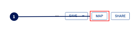
To generate the map, click on MAP in the top right corner of an impact assessment
The scope of the map, and the time taken to generate it, is based on the filters / depth that you have set in the impact assessment.
If the impact assessment is enormous, reducing the depth or applying filters to remove unnecessary data (e.g. unused data assets) will help the map generate faster.
Using the Impact Assessment Map
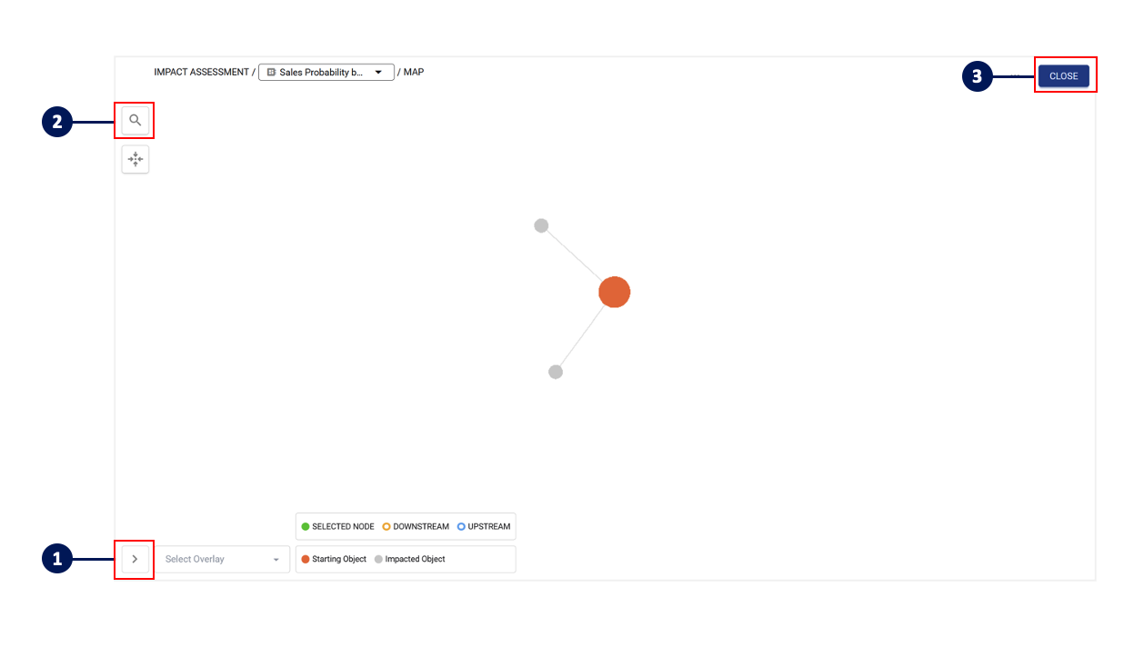
Click on the bottom icon to expand the legend and apply any additional overlays such as schema, usage or category
When there are a large number of nodes, use the search function to quickly locate the node you are searching for
At any time, you can click Close to return to the list view
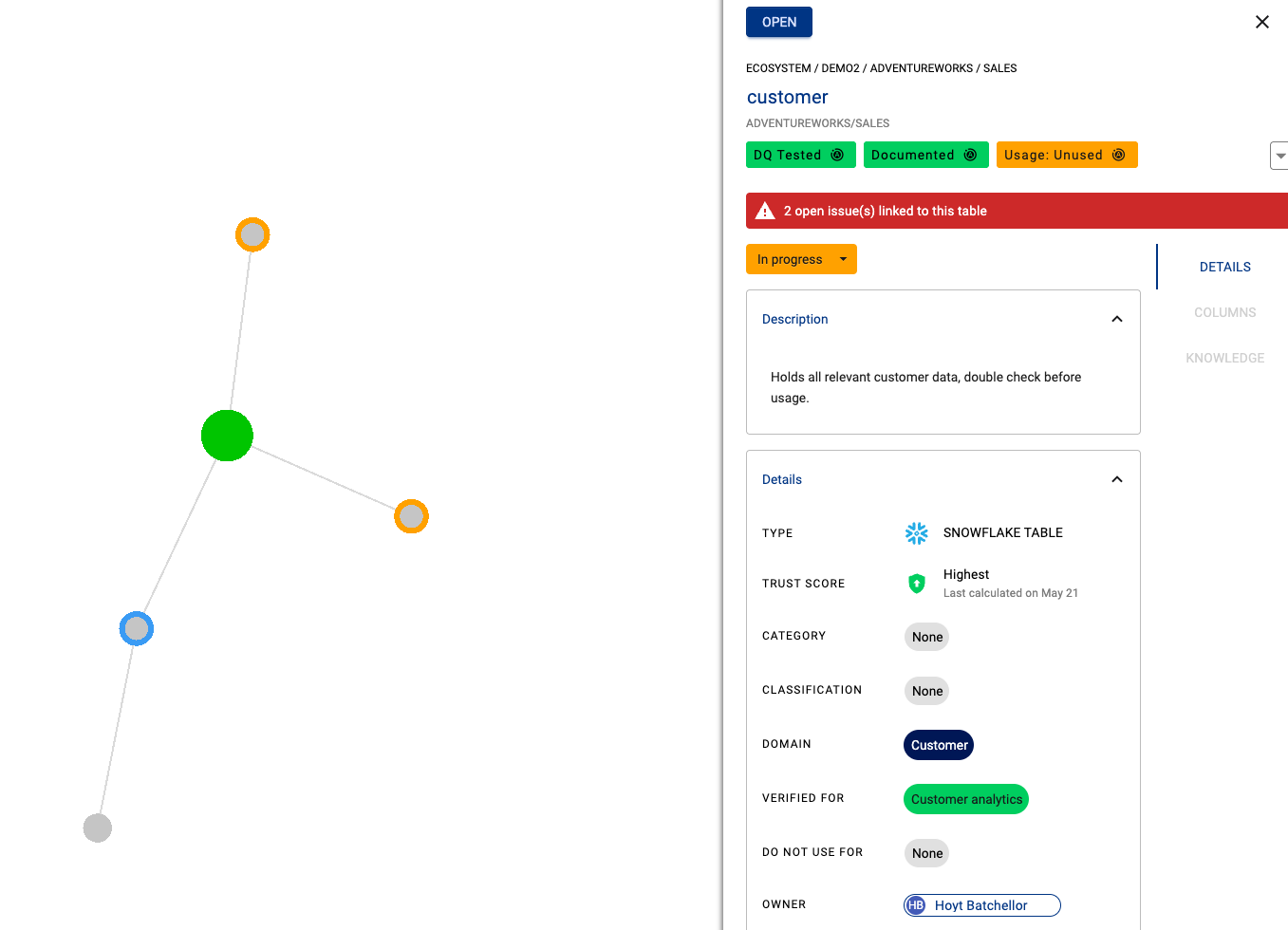
Clicking on a node will bring out the side panel to show more information about the asset